CSS has evolved significantly in recent years, introducing new features and units. One of these units is the viewport unit vh, which is commonly used to match the height of the viewport on desktop browsers. However, on mobile devices, the viewport height can vary depending on whether certain user interface elements are visible or not. This can result in the 100vh unit not matching the actual viewport height.
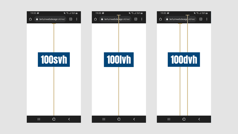
To address this issue, CSS has introduced new viewport units, specifically for small and large viewports, known as svh and lvh, respectively. The small viewport assumes that any dynamically expanded and retracted user interface elements, such as the address bar, are expanded. On the other hand, the large viewport assumes that these elements are retracted.
To use these units, simply set the height property to 100svh or 100lvh, depending on your desired viewport. However, since the user may interact with the page in different ways, the viewport can dynamically change between small and large. In this case, using a fixed unit may not be ideal. Instead, CSS offers the dynamic viewport unit, dvh, which automatically matches either svh or lvh depending on the current viewport.
To use dvh, simply set the height property to 100dvh. This will ensure that the element’s height matches the current viewport, whether it is small or large. By using these new viewport units, developers can create more flexible and responsive designs that adapt to the user’s device and interactions.